Shakespeare in Free Shakespeare in the Park, 1962-2018
One of my favorite things to do in New York City in the summer is go to a New York Public Theater free Shakespeare in the Park performance at Delacorte Theater in Central Park. I try to get there at 6 A.M. when the park opens and wait on line until tickets are handed out at noon. I take a blanket, a book, a laptop, food, drink and sunscreen and spend a pleasant morning on a patch of grass hopefully in the shade. This sounds relaxing, and so it is, but usually by the time I have my tickets in hand I’m stiff and achy from lying on the hard lawn (smarter people bring folding chairs), hot from the sun and ready to go home to shower and have a nap so as to be alert enough to enjoy the play, which usually starts around 7 P.M. the same day.
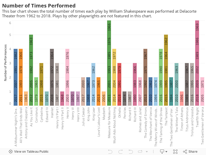
A nap is especially advisable if you are going to see King John. I have seen King John twice, in its full four-hour length, once at Delacorte Theater in Central Park and once in London at Shakespeare’s New Globe. Both times I wondered why someone chose that play. It has some good parts, but unless you know a lot about the Magna Carta of 1215 and the English constitutional crisis that ensued, you may find it hard, as I did, to follow the plot. I suspect that King John is usually staged because it is by Shakespeare; if so, the logical thing would be to stage it once in a full cycle. To my surprise, when New York Public Theater announced in 1997 that it had produced all of Shakespeare’s 37 plays, King John had been staged twice. King John twice, and Antony and Cleopatra only once. This baffling choice piqued my curiosity, so I set to visualizing data I pulled from Wikipedia to see what other unexpected trends might lie in store.
In the following chart you will find a bar chart that lists Shakespeare’s 37 plays and indicates how many times each was performed in the park. Again, if you hover over the chart more information will pop up.
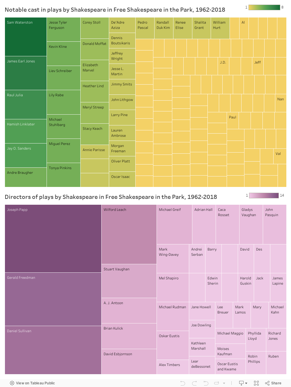
Finally, two treemaps show notable actors who appeared more and less frequently in Free Shakespeare in the Park plays from 1962 to 2018, and which directors directed these plays.
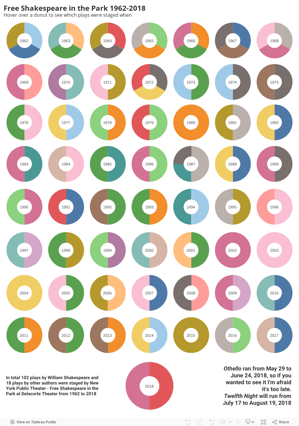
I made about ten sketches before I hit on donuts for my first visualization. This was a particularly challenging visualization to make because it brings together so much information; each year is a small multiple of plays, and it seems important to me that they are seen all together so that we can see the whole theatrical project reaching over time and made up of many diverse elements. Donuts are perfect for this and I was super excited when I came up with my sketch. I wanted to label each donut segment with the name of the play it represents, but labels wouldn’t curve and furthermore tended to sit one upon the other. Another thing that is lacking is in this chart is a color key. I didn’t include a color key because I don’t have one for the whole set; in order to have a tiled set of donuts instead of a string of 56 donuts I had to create a worksheet for each seven donuts and then put them together in a dashboard. Each worksheet has its own key which I hid these because I wanted one key for all the donuts, not a key for each row. I wanted the viewer to be able to click on, say, Measure for Measure, and segments representing that play would leap to the foreground in every year it was performed. My tooltips are a bit wonky at times, and the label for 2002 got lost.
My bar chart is straightforward and is the chart that best answers my research question of how many times each of Shakespeare’s plays has been performed in the park. Years should probably go the other way with most recent at the top. Performances should have the same colors throughout all the visualizations and I am afraid that they don’t.
I chose treemaps for notable actors and directors because after the circular donuts and the bar chart rods, squares are pleasing to the eye. In addition to this I considered treemaps a good way to show who has had a lot of presence in Free Shakespeare in the Park because the larger darker squares stand out more, as do actors and directors who have worked there a lot. I am not happy with the pesky asterisks which show up in tooltips when someone has worked in more than one play. I want all the plays to be listed in tooltips but I can’t figure out how. The articles I found on Tableau Help gave me instructions for listing multiple entries in tooltip but after trying a lot I gave up, because tooltip was not doing what I expected it to do. I compromised by providing less information that I had originally intended to provide, but there are no asterisks any more.
I built these visualizations with data taken from the Wikipedia entry “List of Shakespeare in the Park productions at the Delacorte Theater” (2018). I may add more data to this and draw also from Lortel Archives which has a ton of interesting and useful information about off-Broadway plays.
Note: one can also get tickets in the park on the standby line (both times I lined up at 5pm I got tickets), by lottery on the Today Tix app or at the New York Public Theater on Astor Place or by donating a large sum of money to New York Public Theater.